Changing Skyline: German Edition
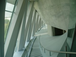
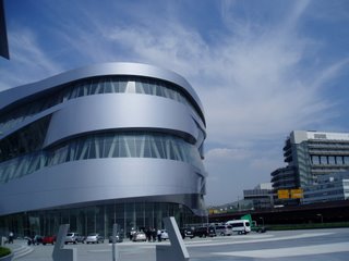 In case any one was wondering why there were no entries here on Skyline Online last week, it was because the house blogger was in Germany inspecting the architecture of the World Cup. My first stop was Stuttgart, where Mercedes Benz is putting the finishing touches its new $200 million museum, designed by the up-and-coming Dutch firm, UN Studio. It's meant to look as if you could drive right in, though you can't, of course. The interior is a mind-blowing, triple mobius ramp.
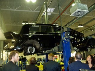
As cars go, Mercedes-Benz are better designed than most. But after being forced to look at - and nod politely at - hundreds of Mercedes (and their engines!) over a two-day span, I never want to see another one again, except for this beauty on the hoist in the company garage. It used to belong to Francisco Franco, who hardly put any mileage on it. He's still dead, by the way.
The company figures that sports fans are also car fans, and will save a little time to visit the museum.
But if they're also architecture fans, they will certainly make their way to Munich to check out Herzog & De Meuron's new Allianz Arena, which resembles either 1) a squashed golf ball 2) a squashed Michelin Man or 3) a bubble-wrapped alien spacecraft.
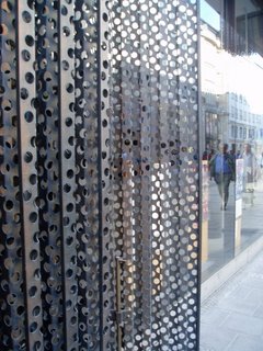
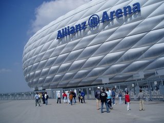 Whichever description you prefer, it's a relief to know that all sports stadiums don't have to be red-brick-clad nostalgia fests. It's also nice to see what Herzog & De Meuron did with a modern shopping mall in historic downtown Munich, slipping it elegantly and interestingly between two 19th Century commercial buildings. Note how they maintain the massing, scale and plane of the existing buildings. Another good lesson for red-brick Philadelphia.The dark elements over the windows are perforated metal shutters that slide open and closed. I promise more extensive reviews in future articles in the Inquirer.


2 Comments:
That shopping mall is perfect for the space and the urban context—much better than the Gallery, for instance. I'll bet it's less confusing inside than the Gallery, too, although that wouldn't be difficult.
Wow. Imagine, creative and appropriate and thoughtful use of space. Wow. It really is possible.
Post a Comment
<< Home