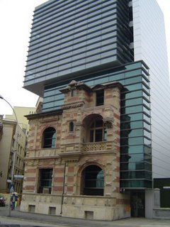
Terence Riley, MOMA's departing architecture curator, stopped in at Penn's Meyerson Hall last night for a lecture. During the 15 years that he ruled at MOMA, the frumpy academic was among the architecture world's top arbiters of taste. Now he's on his way to sunnier climes to take the helm at the fledgling Miami Art Museum.
His talk was mainly interesting for being an insider's view of the style wars of the last three decades between the rising post-modernists, the old-fogey modernists and the resurgent neo-modernists (a term that Riley dislikes, by the way.) Riley wove his historical account around the ups-and-downs of Mies van der Rohe's career and reputation, arguing that Mies is a far more complex, subtle - and
postmodernist - architect than is generally acknowledged. Okay. We'll buy that.
Like his predecessor in the lecture series, Charles Jencks, Riley offered one really interesting idea that is worth chewing over: The "meaning in architecture," he asserted, "has shifted from form to surface." Comparing building facades to video and computer screens, he said that architecture is also a "screen that accepts information. It's very expensive wallpaper."

I've been thinking a lot about surfaces lately, perhaps because there has been an abrupt taste change in Philadelphia from red brick to glass. Where once condo developers couldn't get enough red brick and pre-cast, they now all seem to want their towers poured into a smooth, skin-tight sheathe of glass.
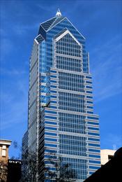
The Murano. Residences at the Ritz-Carlton, 1441 Chestnut Street, the newly proposed Bridgman's View all have the kind of glass skins normally found on office towers and pioneered by Mies. They're not alone. Several recent New York condo towers, like Gwathmey Siegal's on Astor Place, chose the same surface material. Exactly what information is being conveyed by that inscrutable smoothness? There's something very distancing about that glass screen. Living behind those big, clear windows must be a little like experiencing the city while dressed in one of those contamination suits.
Paul Goldberger, the New Yorker critic ande dean of the architecture school at Parsons, calls the residential glass skins "the new white brick" in a very perceptive article in the current issue of
Metropolis.

Without the mediating force of visible steel or concrete members, he worries that the buildings are too brittle, too cold, too light on the hard, masonry-dominated urban ground. Alex Marshall offered some similar thoughts two years ago in
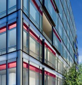
Slate. At the time, Richard Meier's Perry Street towers were the smoothest things going. Now, in comparison with the new glass towers, they look positively nubby. The facade of Jean Nouvel's 40 Mercer Street, in New York, (left) offers an appealing compromise.


