Bohlin Cywinski Jackson's Perfect Cube
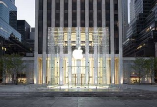
 Guess what's become the coolest hangout and biggest tourist draw in midtown Manhattan? The magically minimalist Apple store on the Saharan plaza of the General Motors building at Fifth Avenue and 59th Street, created by the San Francisco office of the Philadelphia-based Bohlin Cynwinski Jackson. Ever since Bill Gates hired the architects to design his 40,000-square-foot, computer-driven hacienda in Seattle, the firm has carved out a techno niche for itself - although not in Philadelphia, where the firm still tries to strike a compromise between a modern sensibility and Philadelphia's red-brick heritage. Their local works include the recent Liberty Bell Pavillion (and its very unfortunate companion, the Liberty Bell restrooms), an addition to the Penn dental school, and the Germantown Friends fieldhouse. But they also showed they could work in shades of all gray with the Tuttleman Learning Center at Temple University.
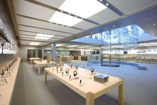
But even the Tuttlemen doesn't prepare you for the disciplined dazzle of the Apple store. The entry is a perfect glass cube that floats on the plaza (once home to a sunken bar where people sipped drinks while sitting in miniature Chryslers). The cube houses a cylindrical elevator, wrapped with a spiral staircase, that takes you down into the sprawling, column-free underground retail space. It's only one flight down, but you feel as if you been zapped to another world by a transporter. I saw hundreds of customers clustered around heavy wood Parsons tables, trying out various Apple products and gadgets, dispatching emails, blogging, downloading music, and who knows what else.
 The cube acts as a giant light-gathering tower, funnelling vast amount of natural light into the basement. Brokers once referred to the retail space as the pit because of dark, dank location, says Peter Slatin (You may have to register for this link.) No more. More than one person emerging from the transporter was heard to murmur, "wow."
 There's a rumor going around Philadelphia that Apple is searching for a store site here. If that happens, Bohlin Cywinski Jackson is likely to be tapped for the design. We'd love to see what the firm could do here for a client like Apple. But no red brick, please.


10 Comments:
are there any spaces left on the 4 blocks b/w Broad & 18th that could hold an Apple store? you'd think that Apple might locate in a "hip" place like Old City or WashWest, but I just don't see them breaking ground anywhere but RittRow.
Apple could easily go to a "hip" area. In NYC there was a store in the village years before this store opened in midtown.
The New York City Police Department on Thursday was called to the site of Apple's flamboyant new retail shop to rescue a group of students that had become stuck inside store's glass-encapsulated elevator system.
Click Here!
The six students were visiting Manhattan as part of a school trip, one wrote in a blog posting about the incident. She said all but herself wound up stuck inside the captivating gizmo for about 45 minutes while the police were called to the scene.
As the students waited to be rescued, Apple Store employees used step-stools to slip bottles of water through the elevator's erratically opening and closing doors. All the students eventually exited safely once police leaked the hydraulic lines, though some were reported to have received minor burns.
The elevator is part of the $9 million 32-foot glass cube that rests atop the new Apple store in the plaza of the General Motors building on Fifth Avenue. It's wrapped by a circular staircase -- also made of glass -- that takes patrons to the 20,000-square-foot subterranean retail space.
According to reports, the cube was designed and paid for by Apple chief executive Steve Jobs. In fact, it's also been reported that Jobs demanded he be able to keep the structure at the end of the store's twenty-year lease (though he must replace it with a "comparable structure" before hauling it off).
The Fifth Avenue Apple Store elevator is now "out of order," according to tipsters who swung by location this holiday weekend.
http://www.appleinsider.com/article.php?id=1776
Yeah...great design but is it functional?
It would be great to have projects like this in Philadelphia, but it probably won’t happen. Why? Because Philadelphia is simply stuck in the past, especially when it comes to architecture. That’s why we end up with all of these faux colonial and Victorians complete with plastic brick siding and street-level parking garages facing the street. People actually buy these things!
This stuck-in-the-past mentality is evident in the mixed—often negative—reactions to the Cira Center, one of the best projects in Philadelphia since the 1960s (the others are mainly by locals Erdy McHenry), as well as people’s disdain for the city’s mid-century modern buildings (Society Hill Towers, Hopkinson House, Rohm & Haas, the State Office Building, the Roundhouse, etc.). Whenever they come up on Phillyblog.com or elsewhere, people rant about how they’re ugly monstrosities and out of scale and how they lack any decoration.
New York (and just about any other major city in the world) embraces modernism. They even integrate modern buildings into their most historic districts. I think it says something sad about our city. Maybe it’s some sort of admission on the part of the people that the city’s best days are behind us and we have nothing to offer the future. I don’t believe that to be true. I think this city can go far if people just start looking forward instead of backwards.
First of all the Apple Store that you are talking about is 100% under the drab CBS Morning Show Plaza (picture the proposed underground Phila Art Museum parking garage). The photo that you are showing is basically the roof of the store. Secondly, NYC has embraced modernism full on and does not have a preservation society with any power. Basically you can build any modern skyscrapper, building, parking garage you want as long as you have the money to tear down the what would be designated as "Historic" buildings in Philadelphia. It's a darn shame too, have you ever seen the Rivington Hotel in the Lower East Side. It's a twenty-story glass-and-aluminum conception on the area’s self-consciously bohemian tenementscape. They tore down alot of 19th century buildings to put it up, and it looks very out of place.
"But no red brick, please."
Is why you should be a critic in a west coast city..
"But no red brick, please."
Is why you should be a critic in a west coast city…
This is exactly my point when I say that Philadelphia is stuck in the past. Anytime someone even suggests anything remotely progressive you have a bunch of knuckleheads criticizing it to death. I’m not sure if it’s misdirected Philly pride or if it’s just plain stupidity—it’s most likely a bit of both. Maybe, just maybe, we would have things like jobs and an effective city government or even a few less vacant lots if people with fresh, new ideas weren’t forced to go elsewhere to see them realized.
The ironic thing about all these people who think that modernism is awful is that it’s contradictory to Philadelphia’s past, which everybody seems to want to hold onto to the point of stagnation.
Philly’s history is filled with some of the world’s most forward-looking people, like William Penn, Benjamin Franklin, Alexander Calder, Louis Kahn and many others. Architecture tells a lot about a place.
Faux historic buildings are not only an embarrassment to the city and the people who live here, but also an affront to the city’s rich architectural history. Modernism is a sign of vitality, and it can be embraced without being at the expense of historic preservation.
And by the way, New York City’s not on the west coast.
Have you been to the Apple Store at Suburban Square Mall in Ardmore? It's certainly not a remarkable thing like the NYC store, but it does have the same glass-front-with-gray motif, with the same tables, lots of white (and/or metallic - and functional!)walls, and lots of toys for geeks and would-be geeks.
Recommended - not for architecture, just for the interior design and for mac geeks.
As to the mild flamewar between anonymous (4:11 pm) and anonymous (7:30 pm), I don't even understand the first one's comment
"you should be a critic in a west coast city" - because Philadelphia's too backwards to support a critic who likes pretty, useful, clean, human, accessible buildings? Because architecture should be just like it was back in the day - staid, ugly, and out-of-date? Weird, weird, weird.
I like brick. It fits - on a brick building. It does NOT fit on a bank - and that's why our banks in this town are of gleaming white, dark marble, alabaster columns, and all sorts of other materials. Homes are of concrete - or wood - or gleaming glass.
Why in the name of Bacon would you want a commercial space to be made of brick? To indicate that a Mac store, being essentially ethereal, is tied to the old, "bricks & mortar" economy? Common sense, please.
Uh, yeah, and did you see the Stephen Button buildings before they were torn down to make way for the Jefferson parking garage in the 900 block? Kitty corner to the Victory Building and directly across from the Cret Federal buildings? Philadelphia is no exemplar when it comes to what to save and what to dispose of, nor in the functioning/coordination of its legislative, planning and preservation offices.
And a jazzy Apple store? Can we give them one of the Ed Bacon pits? Interesting idea that just didn't work out. Paris has their Second Empire Louvre and Pei glass pyramid -- we could have our wedding cake City Hall juxtaposed with fabulous contemporary Apple glass.
(People don't adore CIRA? Let me at 'em...)
Apple would never build a red brick building. It was simply Inga trying to be "smart". Someone writes that Inga should write about some west coast city and everyone is up in arms. No one cares that city hall recently placed some legislation about garage fronted dwellings. Just more of the "I wish Philly had garageless rowhomes like San Fran" (irony, irony). I hate the garages but to simply think that we haven't embraced modernism is so out of line. Take a look at a number of projects in Northern Liberties or the Rag Flats in Fishtown. Also, New York is not short on the new faux red brick
Post a Comment
<< Home